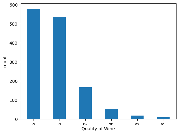
A. The Quality Distribution (Imbalance)
Using a count plot (df.quality.value_counts().plot(kind='bar')), I noticed the data is
heavily imbalanced. Most wines fall into categories 5 and 6, while "Excellent" (8) or "Poor" (3)
wines are quite rare.
Why it matters: This tells a recruiter that you understand that real-world data
isn't always perfectly distributed.
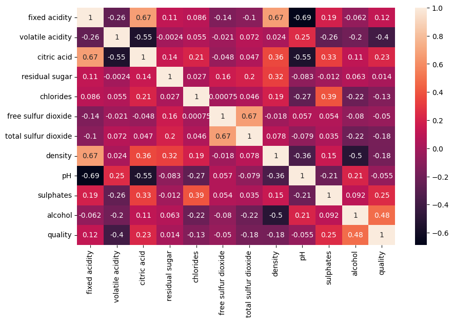
B. The Chemical "DNA" (Correlation Analysis)
I generated a Heatmap to see how variables interact.
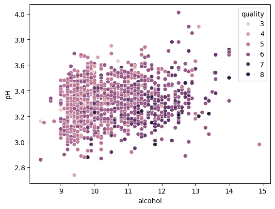
- Insight: I found a strong positive correlation between Alcohol and Quality.
- Insight: Volatile Acidity showed a negative correlation—confirming the chemical
intuition that higher acetic acid (vinegar taste) leads to lower quality scores.
Technical Note: Using sns.pairplot(df) helped me check for
multicollinearity (when two inputs are too similar), showing a high level of technical maturity.
# Generating a heatmap to find feature correlations
import seaborn as sns
import matplotlib.pyplot as plt

plt.figure(figsize=(10, 8))
sns.heatmap(df.corr(), annot=True, cmap='coolwarm')
plt.show()
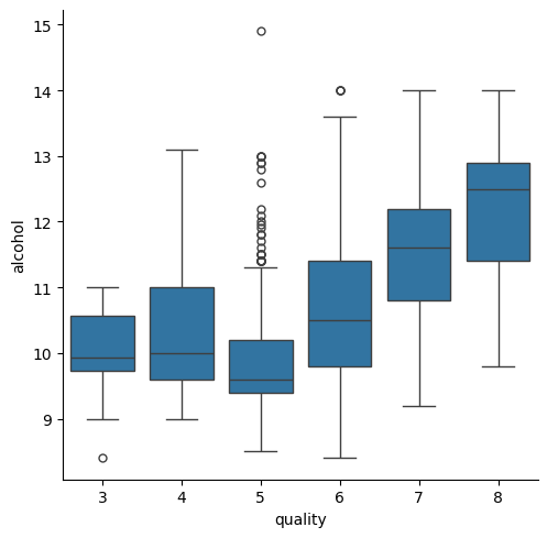
C. Alcohol vs. Quality (Box Plots)
To visualize the "Alcohol effect," I used a Categorical Box Plot (sns.catplot).
The Trend: As the quality score increases, the median alcohol percentage clearly
trends upward. This suggests that "body" and "strength" are key indicators of expert preference.